- Introduction
- Getting started with gvSIG Mobile
- Project management
- Layer management
- Data access formats
- Graphical navigation tools
- Selecting features and querying attributes
- GPS support
- Editing layers
- Appendix A: Portability and data integration with gvSIG Desktop
- Appendix B: Personal forms
Introduction
This guide provides detailed information on gvSIG Mobile and will allow you to use the program to its full potential.
Getting started with gvSIG Mobile
A new session of gvSIG Mobile can be started by performing the following steps:
- Start the mobile device (PDA).
- Open the Windows Mobile start menu and look for the gvSIG Mobile icon.
- Click on the icon to launch the gvSIG Mobile application.
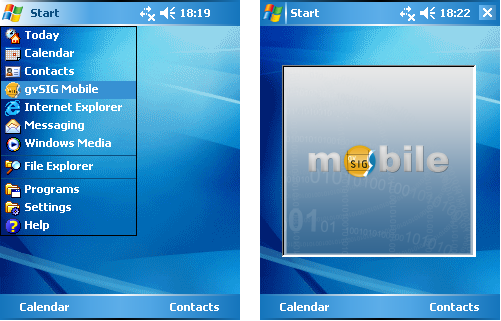
Starting the gvSIG Mobile application
The application has a vertical Main Toolbar (1) with icons representing groups of functions, and a horizontal Secondary Toolbar (2), which shows the specific tools of whichever icon is selected on the main toolbar.
Main Toolbar:
- Project tools.
- GPS tools.
- Layer management tools.
- Navigation tools.
- Information tools.
- Editing tools.
On the right-hand side of the secondary bar is a small button (3) that displays a drop-down menu containing information on each of the tools on the secondary toolbar. Features on this drop-menu can be run by clicking on the relevant icon. The application also contains a View (4) where the maps are displayed, and a Status Bar (5).
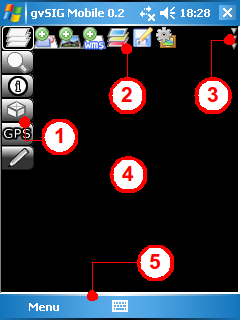
A view of the gvSIG Mobile application
Project management
A gvSIG Mobile project is the environment or base document used to configure, manage and store the geographic information from a particular work session.
After starting gvSIG Mobile, click Project Tools (1) on the main toolbar to display the project management tools on the secondary toolbar.
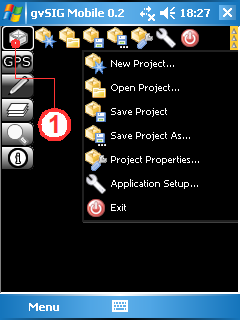
Project management tools
New Project
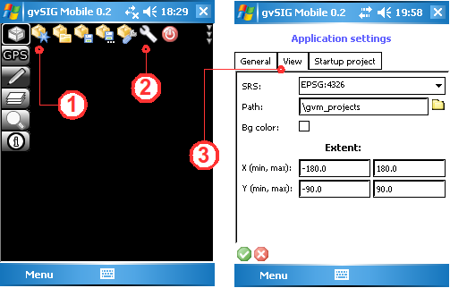
To start working with gvSIG Mobile a new project must be created by clicking the New Project... button (1). This will create a new project, or close the existing project and create a new one. The default properties of a new project can be set in the View tab (3) of the Application Setup... (2). Here it is possible to define the spatial reference system, the path to the project files, the background colour of the view, and the maximum and minimum extents of the project.
Create a new project
Open Project
A previously saved gvSIG Mobile project can be opened by clicking the Open Project... button (1). This opens a standard Windows Mobile Open File dialog from where a project file (GVM) can be selected.
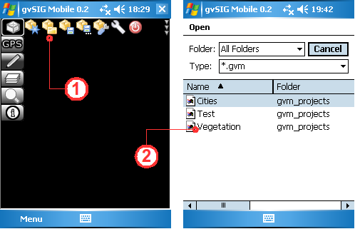
Open an existing project
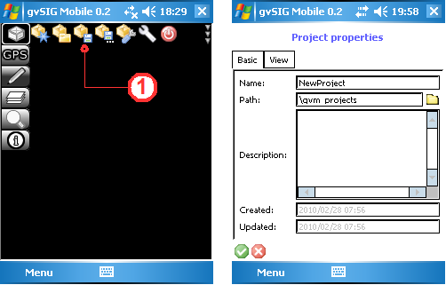
Save Project
Click the Save Project... button (1) to save the project configuration and all the references to the project data. The Basic tab of the Project Properties form (shown below) provides space to enter the name of the new project, the storage location (path), and a description of the project.
Save the project
Save Project As
It is possible to save a copy of the current project with a new name by clicking the Save Project As... button (1). In the Project Properties form enter the project name and storage location.
Save the project with a new name
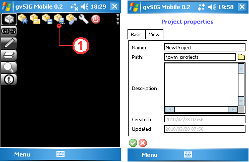
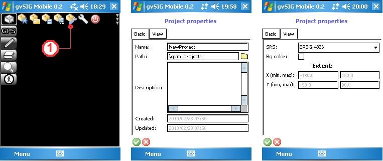
Project Properties
A gvSIG Mobile project contains a number of properties that can be viewed and modified. These are accessed by clicking the Project Properties... button (1). This opens the project properties dialog, which contains two tabs.
Project properties dialog
The Basic tab contains the following information:
- Name. The name of the project.
- Path. The directory path where the project is saved.
- Description. A description of the project.
- Created. The date that the project was created.
- Updated. The date that the projected was last updated.
The View tab contains the following information:
- SRS. The spatial reference system.
- Bg color. The background colour of the view.
- X(min,max). The range of the x-coordinates.
- Y(min,max). The range of the y-coordinates.
Application Setup
It is also possible to define the default properties for new projects. These can be accessed by clicking the Application Setup... button (1), which opens a dialog box with three tabs. Under the View tab (2) the SRS, Path, Background colour, X(min,max) and Y(min,max) properties can be defined.
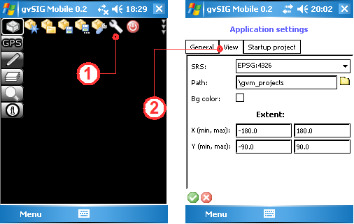
Default project properties
Set default project
gvSIG Mobile allows a default project to be defined. In this way, a previously defined project is loaded on start up, thereby speeding up the commencement of the work session. The default project settings can be found by clicking the Application Setup... button (1) and then selecting the Startup project tab (2). Enable the Active check box and then provide the Full Path to the default project.
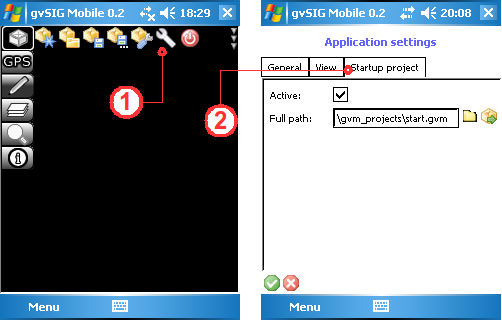
Setting a default project
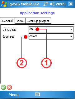
Defining general application settings
The application language (1) can be set under the General tab in Application Settings. gvSIG Mobile is available in English (en), Spanish (es), French (fr), Italian (it) and German (de). If a new default language is chosen, the application must be restarted for the changes to take effect. It is also possible to choose between two icon sets for gvSIG Mobile (2), namely 24x24 and 48x48 pixels. The default size is 24x24, which is suitable for devices with low resolution screens of less than 480 pixels wide. If the mobile device (PDA) supports higher resolutions, the 48x48 icon set can be chosen.
Warning: If the icon set is changed to 48x48 and the mobile device does not support the new setting, the previous setting of 24x24 will not be automatically restored. To restore the setting edit the file "gvSIGMobile/persistence/appsettings.xml" and manually change the icon set back to img24.
Defining general properties for gvSIG Mobile
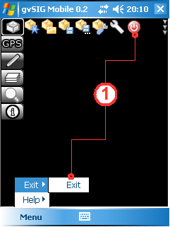
Exit
The Exit button (1) closes the current project (prompting the user to save any changes) and then exits gvSIG Mobile.
Exit gvSIG Mobile
Layer management
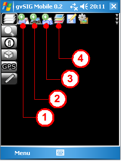
Once the work environment has been created, there are a number of tools that can be used to manage the different layers of information displayed in gvSIG Mobile.
To access them click the Layer Management Tools icon (1) on the main toolbar. This opens the secondary toolbar, which contains a number of layer management tools.
Layer management toolbar
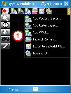
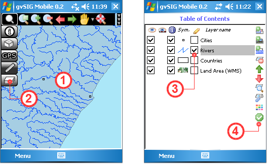
Add layer
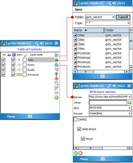
New layers can be added directly from the secondary tool bar layer by clicking the Add Vector Layer ... (1), Add Raster Layer ... (2), or Add WMS (3) buttons. It is also possible to add new layers to the project from the Table of Contents window, which can be opened by clicking the Table of Contents... button (4). This window shows all the layers that are currently loaded in the project. This manager has, amongst others, the same buttons for adding layers that can be found on the secondary toolbar mentioned above.
Add new layers to the project
Add layers from the Table of Contents
Add WMS service
Adding a WMS service layer to the project is done via the WMS Layer Options dialog, where a WMS server can be selected from the drop-down list of Servers (1). New services can be added by typing the web address in the Other box (2) and clicking the Add button. When a new service is added in this manner the Capabilities of the service will be requested. The reference system offered by the service can be selected from the SRS list (3) while the format of the image being selected is set in the Format list (4). The bottom window (5) provides a listing of the layers in the service and allows the layers of interest to be selected.
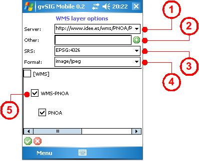
Form for adding a WMS layer
Delete layer
Layers can be removed from the project by accessing the Table of Contents, selecting the layer to be deleted (1), and clicking the Delete Layer button (2).
Delete a layer from the project
Layer properties
Another feature of the Table of Contents is that the properties of any of the layers in the project can be viewed and configured. First select the layer (1) and then click the Layer Properties button (2) to display the Layer Properties dialog. From here the properties can be viewed and modified.
- Name. Layer name
- File. Path and file name of the layer
- Visible. Indicates whether the layer is visible in the project or not (3)
- Infoable. Indicates whether the attributes associated with the layer can be viewed (4)
- Personal Form. A custom form used to display the attributes of the specific layer (5). Tick the check box and provide the path to the form, which should be defined in an .xml file. Personal forms are described in more detail later on in this manual
- Max scale. Indicates the maximum scale of the layer (6)
- Min scale. Indicates the minimum scale of the layer (6)
- Comment. A space for providing information about the layer
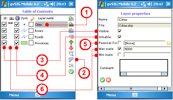
View and modify layer properties
Some of the layer properties, such as their visibility in the view, access to attribute information, or display scales, are shown alongside each layer in the Table of Contents.
Layer visibility
The layers in a project can be switched on or off as needed. This is controlled from the Table of Contents where a check box next to each layer indicates whether it is visible or hidden in the project view. The layer visibility can also be controlled from the Layer Properties form using the Visible check box.
Scale dependent visibility
It is possible to define a visibility range for a layer based on the current scale in the view. The visibility range can be set in the Layer Properties form by entering values for the Max and Min Scales. If visibility ranges have been defined for a layer then this is indicated by the presence of a small icon in the Table of Contents. If the scale bar icon is active (1) then the current scale of the View allows visualisation of the layer, while an inactive icon (2) indicates that the layer is not displayed because the View scale is outside the scale range defined for the layer.
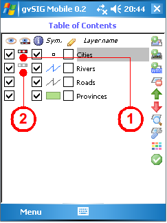
Layer visibility indicated by the scale bar icon
Infoable
Another layer property that can be defined is whether or not their associated attributes are shown. This property can be set either in the Layer Properties form or via the check box in the Table of Contents. When querying layers using the Get Information tool, gvSIG Mobile opens a new window containing the relevant feature attributes if the infoable property of the layer has been enabled.
Display order
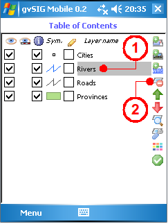
There are two buttons on the side toolbar of the Table of Contents that manipulate the display order of the project layers. The green up arrow (1) moves the selected layer up one place in the display order, while the red down arrow (2) moves the layer down one place in the display order.
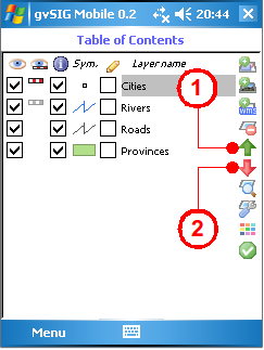
Ordering the layers within the project
Simplified layer symbology
This tool is used define the symbology of a project layer. To edit the symbology select a layer in the Table of Contents (1) and press the Layer Symbology button (2). The Layer Symbology form (shown below) allows the symbology attributes of a vector layer to be edited:
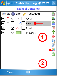
Accessing the Layer Symbology form
- Point layers (3)
- Size. Size of the points
- Colour. Colour of the points
- Line and polyline layers (4)
- Line width. Width of the lines
- Colour. Colour of the lines
- Polygon layers (multi-layer geometries) (5)
- Line width. Width of the polygon border
- Border colour. Colour of the polygon border
- Filled. Indicates whether the polygon is filled
- Fill Colour. Fill colour of the polygon
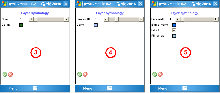
Symbology for points, lines and polygons
Exporting vector layers
With the Export to Vector File utility (1) any vector layer loaded in the Table of Contents can be selected (2) and exported to another supported vector format by either creating a new file or by overwriting an existing one. The available vector formats are GML (Geographic Markup Language) in two different versions (2.x and 3.2), KML (Keyhole Markup Language) and SHP (Shapefile) (3).
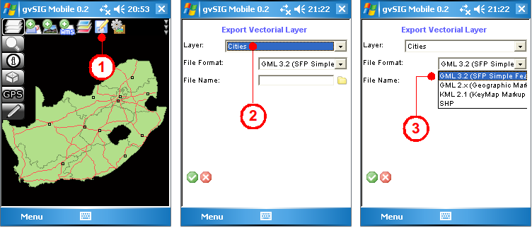
Exporting a vector layer
Capture a screenshot
This utility captures a screenshot of the map displayed in the View on the device (1).
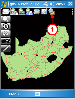
Capturing a screenshot of the View
Data access formats
gvSIG Mobile is currently capable of working with local or remote geographic data in vector or raster format. As shown above, new layers can be added to the project from two different locations in the application. They can either be added directly from the Layer Management Tools secondary toolbar, or they can be added by choosing options from the drop-down list on the right-hand side of the secondary toolbar. In both cases the following buttons are available: Add vector layer, Add Raster Layer, Add WMS.
Vector Data
- 2D and 3D Point and Multipoint Shapefiles
- 2D and 3D Line and Polyline Shapefiles
- 2D and 3D Polygon and MultiPolygon Shapefiles
- MultiGeometry version 2.x and SFP (Simple Features Profile) version 3.2 GML (Geographic Markup Language) files
- MultiGeometry version 2.1 KML (Keymap Markup Language) files
- Point and Track GPX (GPs eXchange) files
Raster Data
- ECW
- GIF (with .wld file)
- JPEG (with .wld file)
OGC Remote Services
- WMS (Web Map Service)
Graphical navigation tools
gvSIG Mobile's various navigation tools allow the user to view the project's graphical information at varying levels of detail, making the browsing of different locations easy and convenient.
In addition to providing a variety of navigation functions, gvSIG Mobile also takes advantage of the navigation buttons on the mobile device itself.
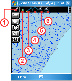
To begin browsing through the different layers in the project, select the Navigation Tools button (1) from the main toolbar. This brings up the secondary bar containing the various navigation tools.
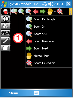
Navigation tools
Zoom by rectangle
This tool allows a zoom area to be defined by drawing a rectangle around the area of interest. Select the Zoom Rectangle button (1) to activate the tool and then draw a rectangle around the desired area to zoom in to it. The tool remains active and can be used repeatedly until it is deactived by clicking on the Zoom Rectangle button once more.
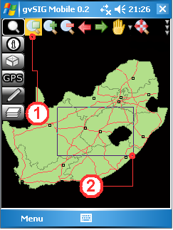
Drawing a zoom rectangle in the view
Fixed zoom in
Clicking the Zoom in button (1) zooms in to the View by a fixed amount, thereby increasing the level of detail each time the button is clicked.
Zoom in increases the level of detail
Fixed zoom out
The Zoom out button (1) decreases the level of detail by reducing the display scale each time the button is clicked.
Zoom out decreases the level of detail
Pan and recentre
By using the Pan tool (1) to drag the map around, the user can interactively recentre the map without changing the scale. Clicking on the map with the Recentre tool (2), on the other hand, causes the View to be recentred on the point clicked by the user, also without changing the scale.
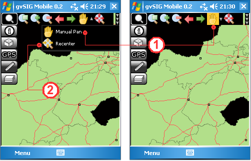
Browse functionality with Pan and Recentre
Zoom to full extent
Clicking the Zoom Extension button (1) will result in the View zooming out to the full extent of all the different layers in the project.
Zoom to the full extent of all the project's layers
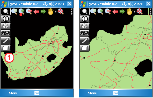
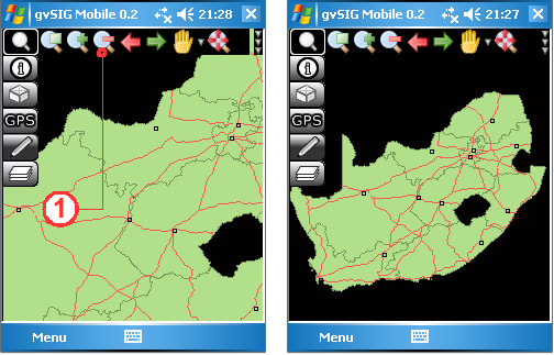
Zoom previous and Zoom next
The Zoom previous button (1) returns to the previous display in the View, while the Zoom next button (2) advances to the next display.
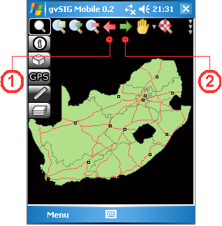
Zoom to the previous or to the next display
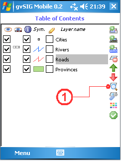
Zoom to selection
The Zoom to selection button (1) is found on the Information tools toolbar, which can be accessed from the main toolbar. Clicking this tool will cause the View to zoom to selected features in the project's vector layers.
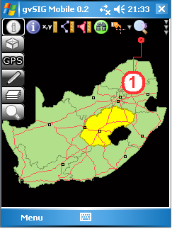
Zoom to selected items
Zoom to layer
The Zoom to layer function (1), located in the sidebar of the Table of Contents, focusses the View on the currently selected layer. When this tool is selected the Table of Contents window is closed and the View is zoomed to the full extent of the selected layer.
Zoom to the layer's extent
Centre View to GPS location
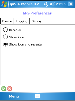
With this utility the user can configure the View to update and focus on the GPS position automatically. To activate this utility select GPS tools on the main toolbar and then click the GPS Setup... button on the secondary toolbar. This opens the GPS Preferences form, which contains several tabs. The Display tab contains various options for configuring the GPS display:
- Recentre. Automatically recentres the View based on the GPS position.
- Show icon. Displays an icon indicating the GPS position.
- Show icon and recentre. Combines the previous two options.
Navigate with GPS positioning
Selecting features and querying attributes
The select and query tools provide a means of obtaining information about the various layers in the project.
To activate these tools, click the Information Tools button (1) on the main toolbar in order to display the secondary toolbar containing the Information functions.
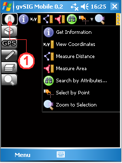
Information toolbar
Obtain information about a feature
This query tool is used to display information about features in the project's layers. Using the Get Information button (1), click on a point in the View to obtain information on the feature(s) at that position. This opens the Information by point form (2), which displays information on the features intersecting the point that was clicked. Note that the query button retains its active or inactive state until clicked again (clicking the button toggles between these two states). With the button in its active state the View can be queried multiple times. If the position queried contains no features then nothing will be displayed. If the layer being queried is a raster layer then the information will be displayed in the format shown in the figure below.
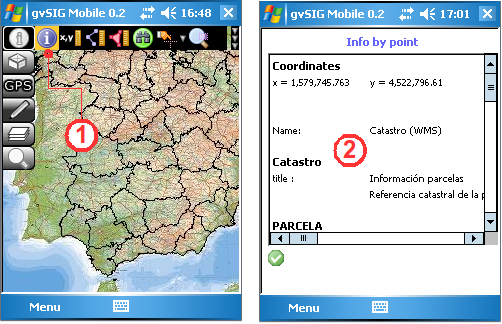
Querying a raster layer
However, if the queried position contains at least one vector layer with editable attributes, then a form is displayed. If the first layer intersected by the query point has a personal form, then this is the form that is displayed. If the layer is not editable, the information displayed in the form cannot be changed and is displayed in a grey colour (3). However, if the layer is editable, then the fields in the form can be edited and will be displayed in black (4). The figure below gives examples of the same information displayed in both a Standard Form (5) and a Personal Form (6). Note that this figure illustrates the forms displayed when the Get Information tool is used to query a vector layer.
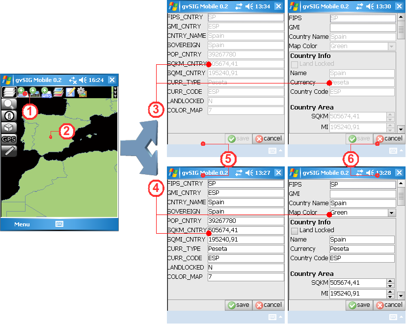
Four different formats for displaying information about a queried vector feature
NOTE:
The information displayed by gvSIG Mobile Pilot version 0.2 when vector layers are queried depends on the following:
- When clicking on the view, the information (if any) that is displayed corresponds to the feature intersecting the point that was clicked.
- The order of the layers influences the information that is displayed.
- Geometry is only shown for the uppermost layer that intersects the query point.
- Information is not displayed for other features intersecting the query point (The previous version of gvSIG Mobile did look at features from layers lower down in the View's layer order).
- To obtain information about features in lower layers obscured by upper layers it is necessary to either change the layer order in the Table of contents, or to disable the Infoable checkboxes of the upper layers.
The Editing Layers section provides more information about Vector Forms, while Appendix B explains how to create Personal Forms.
View coordinates
The View Coordinates tool (1) displays the coordinates of points clicked in the View. These coordinates are displayed in the status bar (2) at the bottom of the View. This tool remains active until deselected, allowing multiple coordinate queries to be made.
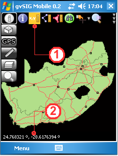
Displaying the coordinates of a point clicked in the View
Measure Distance
This tool is used to measure distances on the map. Once the tool is activated by pressing the Measure Distance button (1), distances between points clicked in the View are displayed in the status bar. Clicking a series of points defines a polyline, and the status bar displays both the total distance (2) of the polyline and the length of the last segment (3). The Measure Distance button remains active once selected, allowing repeated distance measurements to be made and the results displayed in the status bar. To deactivate the tool click the Measure Distance button again.
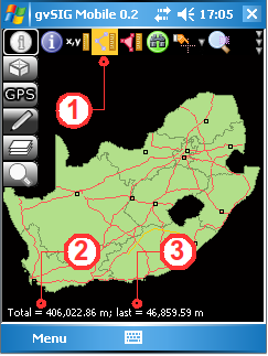
Measuring distances
Measure area
This tool is used to measure areas on the map. Activate the tool by clicking the Measure Area button (1) and then in the View click the vertices of the polygon to be measured. The area of the polygon (2) will be displayed in the status bar at the bottom of the screen. Like the Measure Distance tool, the Measure Area tool also has an active and an inactive state. Once activated it will remain active allowing area measurements to made until the tool is deactivated by clicking on it again.
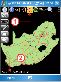
Measuring areas
Search by Attributes
This feature queries the attributes of a vector layer in order to locate records meeting certain criteria. Clicking the Search by Attributes... button (1) opens the Search by attribute value form, which contains the following fields:
- Layer. Select the layer to query from the list of layers in the project.
- Column. Select the attribute column in which to conduct the search.
- Op. Select the query operator.
- Value. Enter the value to search for in the selected attribute column.
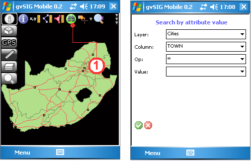
Search the attributes in a layer
Select features
This tool is used to select geometries (1) in a vector layer. When using this tool, only one vector layer must be marked selectable (infoable) in the Table of Contents.
- Select by point. (2) Select a geometry (feature) by clicking on it in the View. The selected geometry will be highlighted in yellow.
- Select by rectangle. (3) Select a set of geometries by drawing a selection rectangle in the View. Geometries wholly or partially within the selection rectangle will be selected. The selected geometries will be highlighted in yellow.
- Clear selection. (4) Deselect all geometries and restore their original colour.
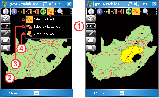
Selecting features in a vector layer
GPS support
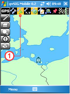
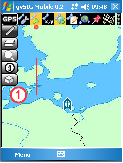
gvSIG Mobile provides facilities for displaying the position of a GPS device, capturing points of interest (waypoints) and recording routes (tracklogs). Clicking the GPS Tools button (1) on the main toolbar opens the secondary toolbar, which shows buttons for configuring the GPS, checking signal strength, displaying the GPS position, etc..
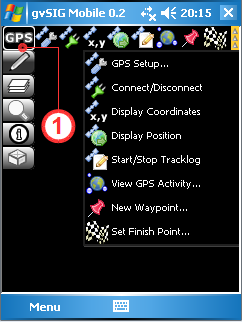
The GPS toolbar
GPS Setup
Utilities and parameters for configuring the GPS connection.
Configuring the GPS
To configure the connection to a GPS device, select the GPS Setup... button (1). This opens the GPS Preferences form as shown below. Under the Device tab, the first parameter that needs to be set is the communication protocol. This is selected from the Protocol drop-down list (2) (At present only the NMEA 0183 protocol is supported). The next setting specifies whether GPS signals are to be received from an active GPS (Serial device), or whether the GPS device will be simulated by using data from a text file containing NMEA GPS data (Simulated device).
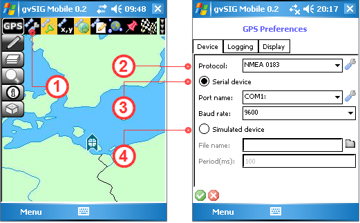
Configuring the connection to the GPS device
If a Serial Device (3) is specified, the Port name and Baud rate are selected from the respective drop-down lists. If the Simulated device (4) option is chosen, then the name of the NMEA data file is entered in the File name text box and the time interval between signals is specified in the Period(ms) box.
The Logging tab is used to specify the format and file names for the waypoints and trackpoints (1) . Two formats are currently supported, namely GPX and CSV. In the Logging File Names section (2) the names of the tracklog file, waypoints file and raw NMEA data file can be specified.
The Stop logging when minimized option (3) is used to suspend recording in the logging files when the application is not visible on the screen of the mobile device.
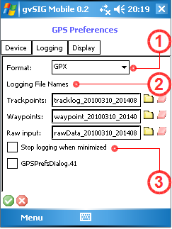
Logging format and logging file names
The Display tab is used to control how the GPS icon is displayed. There are options for recentring the View based on the GPS position (1), displaying the GPS icon (2), or a combination of these two options.
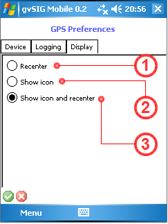
Parameters for controlling the display of the GPS position
Connect to GPS
To activate the GPS signal the mobile device must either have an active internal GPS, or a Bluetooth connection to an external GPS. The connection is activated when the Connect/Disconnect button (1) is clicked.
Activating the GPS signal
Disconnect from the GPS
Click the Connect/Disconnect button (1) again to deactivate the GPS signal.
Deactivating the GPS signal
GPS Navigation
Display GPS position
When the Display Position button (1) is activated a small icon (2) indicating the GPS position is displayed in the View. This display icon can be turned off by clicking the Display Position button again.
Displaying the GPS position
Display GPS coordinates in real-time
The Display Coordinates tool (1) displays the real-time coordinates of the GPS position in the toolbar (2). The units of the coordinates depend on the coordinate system that has been defined.
Display real-time GPS coordinates
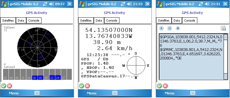
View GPS activity
This feature displays various parameters providing information on the GPS signal and its quality. The feature is activated by clicking the View GPS Activity button (1). This open the GPS Activity form, which contains several tabs:
- Satellites. Shows the satellites that are visible and the quality of the signal being received by the GPS receiver.
- Data. Displays a number of parameters on the GPS position and the quality of that position.
- Console. Displays a plot of the NMEA GPS signal.
View GPS activity
Information on the GPS signal
In addition, when the GPS receiver is connected to the mobile device, a set of icons (1) is displayed in the status bar at bottom right providing information about the quality of the signal reception, the number of visible satellites and the connection status.
Quality of the GPS signal
Capturing GPS positions
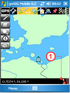
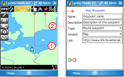
Using the New Waypoint button (2) it is possible to capture waypoints. The full path (tracklog) can be captured by activating the Start/Stop Tracklog button (1). Clicking this button again stops the recording of the tracklog. Note that these tools record the tracklog and waypoints in different text files (as defined under the GPS Preferences described above).
When a new waypoint is defined the New Waypoint form appears, allowing attributes such as Name, Description, Type, Symbol and URL Link to be entered.
New waypoint form
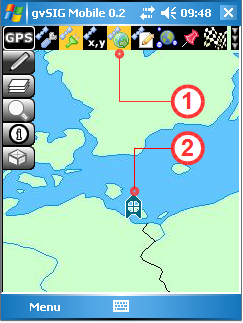
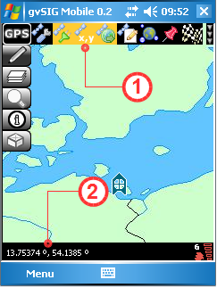
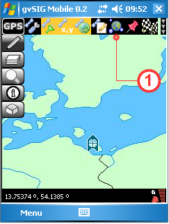
Setting a Destination
This feature allows the user to enter a set of destination coordinates, which are displayed by a chequered flag in the View. The process is started by clicking the Set Finish Point... button (1) and entering the coordinates manually via the Set New Finish Point form. The display of the destination coordinates can be disabled by clicking the Set Finish Point button again. The destination coordinates can be modified as often as is necessary. If the GPS is on, a straight line in the View connects the GPS position with the destination, and the straight line distance to the destination (in metres) is displayed in the status bar.
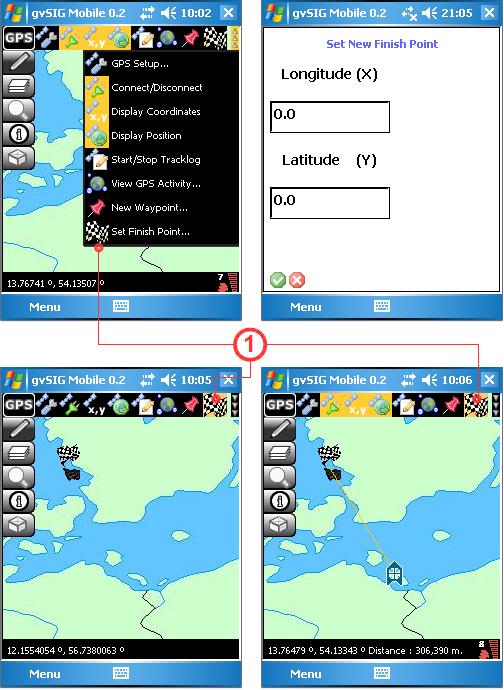
Form for setting a destination
Editing layers
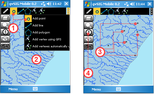
The editing tools are used to create new geometries in previously loaded vector layers. Three types of geometries can be created:
- Points Created with the Point tool (1).
- Lines Created with the Line tool (2).
- Polygons Created with the Polygon tool (3).
There are also editing tools for creating geometries using information from a GPS:
- (Waypoint) Add points with the Add vertex using GPS tool (4).
- (Track) Add a trail of points with the Add vertices automatically using GPS tool (5). Points are captured according to a specified time interval.
Editing toolbar
With the editing tools, vector layers can be updated with new data created by the user. Any new geometries automatically inherit the attributes of the layer being edited. These attributes can be entered once the geometry or feature has been digitised.
The procedure for editing an existing vector layer is as follows:
- Step 1 - Enable Editing: Once a layer has been loaded into the View (1), editing of the layer is enabled in the Table of Contents (hereafter referred to as TOC). As explained earlier in this manual, the TOC is opened from the Layers toolbar (2). To enable editing tick the checkbox (3) below the pencil icon of the layer that is to be edited. Return to the View by clicking the Accept button (4) to close the TOC.
Enable editing of a vector layer
- Step 2 - Select the drawing tool: Select the appropriate drawing tool from the Editing toolbar (1). Note that if the layer being edited is a point layer, then only the Add point (2), Add vertex using GPS (5) and Add vertexes automatically using GPS (6) tools can be activated. For line layers only the Add line (3) and the GPS buttons mentioned above can be activated, while for polygon layers only the Add polygon tool (4) is available. For layers that support multiple geometries, for example GML layers, any of the drawing tools can be activated. When a tool is selected and activated for editing it is displayed with a yellow background.
Activating editing tools
- Step 3 - Add New Geometries: Explanations of how to use the various drawing tools appear below.
Add Point Tool:
Once the Add point tool (1) is activated, new points are added to the editable layer by clicking at the desired positions in the View (2). As many points as is needed can be digitised in this manner. New points are generated with the same attributes as in the layer being edited, except that these attributes are empty. To enter attribute data for a point first activate the Get Information tool (4) from the Information Management toolbar, then click on the new point to bring up the attributes form. Attributes can be entered using this form.
Adding points to a vector layer
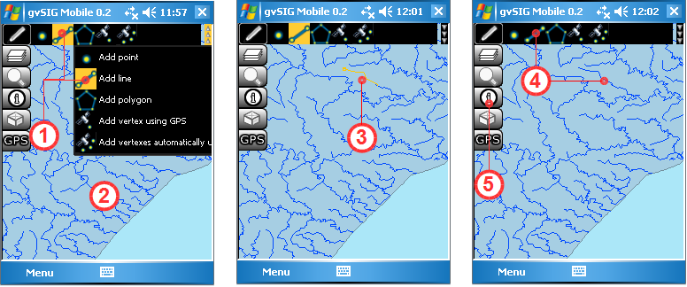
Add Line Tool:
Once the Add line tool (1) has been selected, a new line is created in the View (2) by digitising a series of points that define the line (3). While the line is being edited it is displayed in yellow (3) but once it has been completed it will be displayed in the same colour as the other lines in the layer. A line is completed by clicking the Add line tool again (4) or by "double-clicking". Care should therefore be taken when digitising a line as clicking too rapidly might be interpreted by the program as a double-click signifying completion of the line. Once the line has been completed attributes may be edited by using the Get Information tool (5) to bring up the attributes form for the new line feature. As with points, the new line inherits the same attribute fields as defined for the layer in which editing is taking place. Note that the attributes of a line cannot be entered until the editing of the line is complete. Bear in mind that any edits or changes can still be rejected by choosing not to save them to disk.
Adding lines to a vector layer
Add Polygon Tool:
After selecting the Add Polygon tool (1), start digitising the polygon in the View (2) by clicking a series of points to make up the shape of the polygon. As successive points of the polygon are digitised the outline of the polygon is shown in yellow (3). To finish editing the polygon, either "double-click" on the final point of the polygon or click the Add Polygon tool (4) again. The newly digitised polygon takes on the fill and outline colour properties of the layer into which it has been added. Once again, care should be taken not to digitise the polygon too quickly as rapid clicks might be interpreted as a double-click signifying completion of the polygon. Attributes can't be entered while the polygon is still being digitised. First complete the polygon and then bring up the attributes form with the Get Information tool (5). The attributes are inherited from the polygon layer being edited.
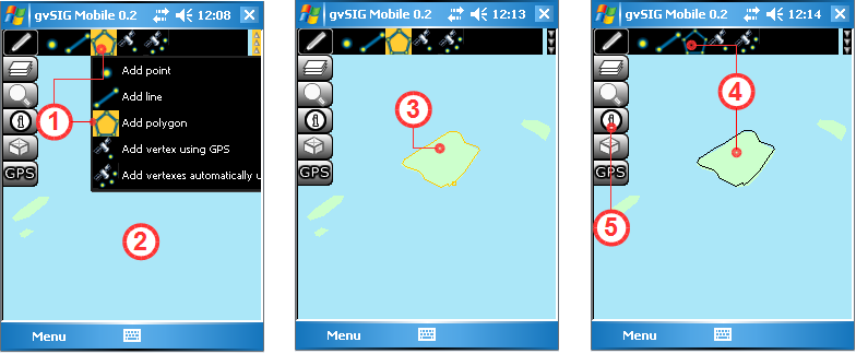
Adding polygons to a vector layer
Add Vertex using GPS Tool:
This tool, which requires a GPS to be connected and running, is easy to use. Simply click the Add Vertex using GPS tool (1) to add a new vertex using the current GPS position. The tool uses the GPS as a simple and effective means of creating reliable points, thereby eliminating possible errors that might be introduced when digitising "freehand".
Add Vertices Automatically using GPS Tool:
As with the previous tool, this one also requires the GPS to be connected and running before it can be activated. The tool facilitates the capturing of accurate point information from GPS readings, reducing possible errors that may arise from manual digitising of vertices. The main difference between the Add Vertices Automatically using GPS tool (1) and the previous one is that new vertices are captured automatically from the GPS at user-defined time intervals. In this manner a visible TrackLog with editable attributes is generated in the specified layer.
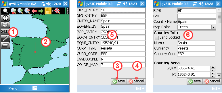
- How to Enter/Edit Attribute Values:
The following steps describe how to enter attribute values for newly created geometries and how to modify the attributes of existing geometries in the layer being edited. To edit attributes the layer must be active and editable, as described in Step 1 above. Open the Information Tools and select the Get Information tool (1) described previously in this manual. Use this tool to select a newly created geometry from the editable layer in the View (2), or select an existing geometry for which the attributes need to be updated. Selecting a geometry brings up either a Standard Form (5) or a Personal Form (6), which can be used to enter or edit the geometry's attributes. If a Personal Form (6) has been defined for the layer then this is used in place of the Standard Form (5) for both editing and viewing of attributes. When the entering/editing of attributes is complete the changes are saved by clicking the Save button (3). Clicking the Cancel button (4) will cancel any changes and revert to the previously saved attribute values. The following figures show the attribute forms for a new polygon created with the polygon tool (top) and for an existing polygon in the editable layer (bottom).
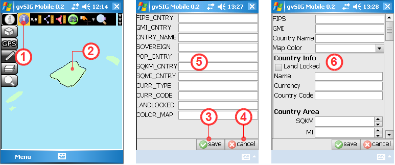
Entering attributes for a newly digitised geometry
Editing attributes of an existing geometry in the layer
- Step 4 - Save/Reject edits:
The final step is to ensure that the new geometries, their attributes and any other changes are saved permanently in the vector file on disk. This is done by returning to the TOC (1) and unchecking the Enable editing box (2). This brings up an Information Window (3) asking the user whether to save the layer or not. Clicking the OK button saves any edits permanently to disk while clicking the Cancel button causes any changes to be discarded (4). If you do not wish to overwrite the original layer then the edits can be saved in a new layer with a different filename using the Export to Vector File tool on the Layer Management toolbar described previously. This file can be exported in any of the formats supported by the Export tool.
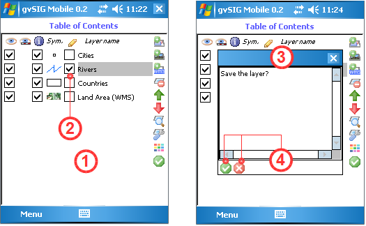
Save/Cancel the edits of the vector layer
NOTE:
There are a number of limitations when editing layers:
- The layer must be a vector layer.
- Only one vector layer can be edited at a time.
- If the original vector layer contains a single type of geometry (points, lines or polygons) then only the same type of geometry can be added.
- It is not possible to create new attributes that are not already in the layer being edited. Each new geometry only inherits attributes already existing for other geometries in the layer.
- It is not possible to modify geometries that existed in the layer before editing was enabled. However, it is possible to edit their attributes.
- To cancel any changes made since editing was enabled, simply uncheck the Editing checkbox in the TOC and click the cancel button when asked to save changes. The layer will return to the state it was in prior to any editing.
- Generating of points and track points from a GPS is only be possible if the GPS is enabled and working properly.
Appendix A: Portability and data integration with gvSIG Desktop
The gvSIG Mobile Export extension for gvSIG Desktop is used to exchange data between gvSIG Desktop and gvSIG Mobile. It is useful for exporting layers to gvSIG Mobile that first need to be modified or clipped. This extension facilitates the transfer of mapping information between the two different platforms.
Installing the gvSIG Mobile Export Extension on gvSIG Desktop
The first step is to install the gvSIG Desktop extension that transfers data from gvSIG Desktop to gvSIG Mobile on the mobile device.
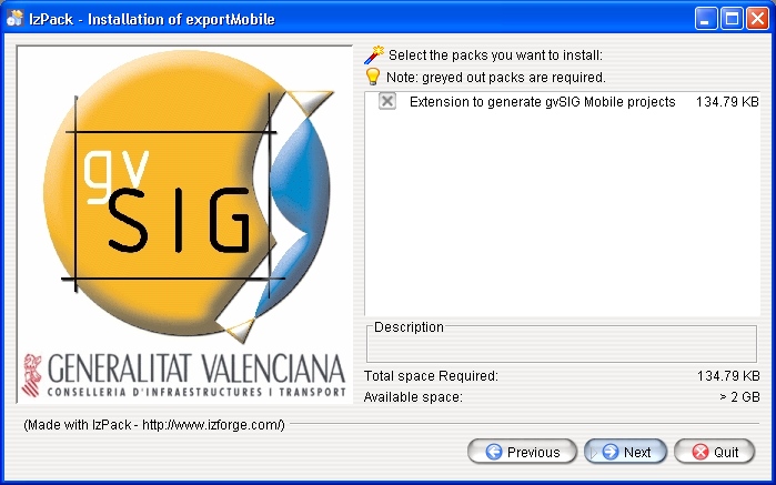
Installer for the data export extension
This extension can be used to export all layers of a project, whether local or remote, along with their symbology.
Configuring the export
The View menu of gvSIG contains the Export to gvSIG mobile... option which opens the window of the exporter. The export window can also be opened by clicking the relevant icon on the toolbar.
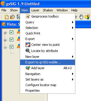
Starting the export process in gvSIG Desktop
Setting the export parameters
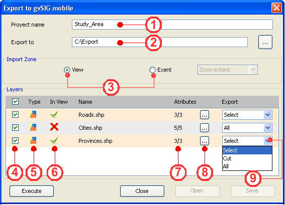
The exporter creates a new project that can be opened in gvSIG Mobile. In the exporter window indicate the name of the new project as well the destination folder in the text boxes Project name (1) and Export to (2).
The export area for the layers can be specified as the current View (3) (this is the default option) or a saved Extent (select a saved zoom extent from the drop-down list).
Once the export area has been specified, the export layers and attributes are chosen. In the Layers section indicate which layers are to be exported by selecting the appropriate check boxes (4). The Layers sections also indicates the layer type (5), whether the layer is visible within the view (6), the layer name, the number of fields in the attribute table of each layer to export (7), and the selection process (9).
With respect to the attributes, the user can specify which attribute fields to export for each layer. Click the button next to the total number of attributes (8) and select the fields to be exported to gvSIG Mobile.
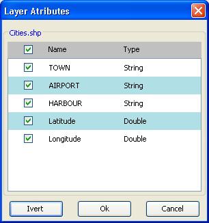
Choosing which attributes to export
Finally, select the export method for each vector layer (for raster layers the entire raster is exported, provided they intersect with the region shown in the view).
- Selection. This option exports only those layer geometries that intersect the view. Any geometries that don't intersect the view (i.e. aren't visible) won't be exported.
- Cut. (CLIP) This option clips all layer geometries to the extent of the view and exports the clipped geometries.
- All. This option exports the entire layer.
Exporting the data
After configuring the export options for the different layers the export process is started by clicking the Execute button (1). The exporter creates a new folder in the indicated path and then saves the selected layers and gvSIG Mobile project (gvm) into this folder. This project can be opened with gvSIG Mobile.
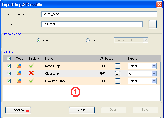
Perform the export
NOTE:
In gvSIG version 1.1:
- There is a bug in the CLIP function that produces a fault with some data sources. In this case it is recommended that the select option is used instead of clip. This error occurs when a SHP.QIX files is present alongside the SHP file (the problem disappears if it is removed).
- The CLIP process fails when some of the attributes have NULL values (this is often an indication that the SHP/DBF files are corrupted).
Appendix B: Personal forms
Personal forms are used to view, edit and insert alphanumeric data, exactly as with a generic form, the difference being that the appearance of the various components is defined by the user. A personal form can display data in tabular format, define ranges of integers to be met by the values contained in the fields, or even display icons alongside labels.
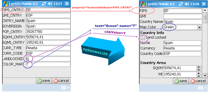
Customizing a generic gvSIG Mobile form for use with a particular layer
Personal forms in gvSIG Mobile are based on Thinlet
- Thinlet is a User Interface tool that takes up very little space. It is a Java class, which interprets an XML file to display information on screen, handle user input, and perform basic associated operations. It separates the graphical display (defined in an XML file) from the methods of the application (which are written in Java).
gvSIG Mobile already has generic application methods that interpret forms, execute the most common field operations, and present data in an appropriate manner.
Creating a form step-by-step
Step 1: Create a new XML file
Use a text editor to create a new text file with an extension of XML, for example "form.xml".
Step 2: Select the components to appear on the form
Decide which components are needed to represent the desired attributes. The types of components that are available are as follows:
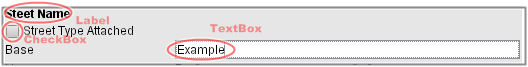
A label followed by a checkbox and a text field
Text field A text box to enter data associated with an attribute of a feature.
<textfield property="featureAttribute=attribute_name"/>
Password field A text box that hides the text entered by the user.
<passwordfield text="secret value"/>
Text area A box in which to enter several lines of data associated with an attribute.
<textarea text="TextArea" wrap="true" columns="40" rows="2" property="featureAttribute=attribute_name"/>
Text label A label used to name an attribute, or to display information on the form.
<label text="Label" icon="image.gif" alignment="center" />
Checkbox A selection box associated with an attribute that allows only two values, namely selected or not selected.
<checkbox text="CheckBox" icon="image.gif" selected="true"/>
<checkbox text="RadioButton-on" group="group" selected="true"/>
<checkbox text="RadioButton" group="group"/>
Combo box A component that displays a drop-down list of values. Values can be selected from the list or a new value can be entered in the text box part of the combo box.
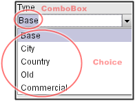
A combo box showing a drop-down list of values that can be selected
<combobox colspan="1" property="featureAttribute=OPTION">
      <choice text="Option 1" name="CODE1"/>
      <choice text="Option 2" name="CODE2"/>
      ...
      <choice text="Disabled" enabled="false" />
</combobox>
Numeric ranges A box in which to enter number within a particular range. The box has buttons to increase and decrease the number.
<spinbox text="0" minimum="0" maximum="120" property="featureAttribute=SPEED_LIMIT">
Step 3: Design the layout and grouping of the attributes
If attributes of a feature need to be grouped, or if grouping is needed to structure the form then the following components can be used:
Table A table is used to display several attributes that can have multiple values. n x m (n samples of m values).
<table colspan="3" selection="multiple">
<header>
    <column text="Attribute"/>
    <column text="L"/>
    <column text="R"/>
</header>
<row selected="true">
    <cell name="AreaId" text="AreaId" enabled="false"/>
    <cell property="featureAttribute=L_AREA_ID" enabled="true"/>
    <cell property="featureAttribute=R_AREA_ID" enabled="true"/>
</row>
<row>
    <cell name="Postcode" text="Postcode" enabled="false"/>
    <cell property="featureAttribute=L_POSTCODE"/>
    <cell property="featureAttribute=R_POSTCODE"/>
</row>
<row>
    <cell name="NumZones" text="NumZones" enabled="false"/>
    <cell property="featureAttribute=L_NUMZONES"/>
    <cell property="featureAttribute=R_NUMZONES"/>
</row>
</table>
Tree Attributes are displayed in hierarchical form using a tree structure.
<tree colspan="3" selection="multiple">
    <node name="AreaId" text="AreaId">
         <node text="L">
             <node property="featureAttribute=L_AREA_ID" selected="true" />
         </node>
         <node text="R">
             <node property="featureAttribute=R_AREA_ID" selected="true" />
         </node>
    </node>
    <node name="Postcode" text="Postcode">
         <node text="L">
              <node property="featureAttribute=L_POSTCODE" selected="true" />
         </node>
         <node text="R">
              <node property="featureAttribute=R_POSTCODE" selected="true" />
         </node>
    </node>
    <node name="NumZones" text="NumZones">
         <node text="L">
              <node property="featureAttribute=L_NUMZONES" selected="true" />
         </node>
         <node text="R">
              <node property="featureAttribute=R_NUMZONES" selected="true" />
         </node>
    </node>
</tree>
Tab Tabs can be used to group attributes, which can be displayed using any of the component types described above.
<tabbedpane placement="left" selected="1" action="tabchanged">
    <tab text="One">
         ....
         Components
         ....
    </tab>
    <tab text="Two" alignment="right">
         ....
         Components
         ....
    </tab>
</tabbedpane>
Panel Groups of related attributes can be displayed on separate panels. A panel can contain any of the component types described above.
<panel columns="3" gap="4" top="4" left="4" bottom="4" right="4">
          ....
          Components
          ....
</panel>
Step 4: Write the XML file
Once the components have been selected and the layout has been designed, the XML code can be written. The table below lists the general attributes of components that can be included on a form.
Component Attributes
A list of some of the properties common to all the most frequently used components.
| PROPERTY | TYPE | FUNCTION |
|---|---|---|
| name | string | Identifies the component so that it can be referenced by other components. |
| visible | boolean | If set to "false" the component does not appear. |
| font | font | Define the text font. |
| foreground | color | Define the text colour. |
| background | color | Define the background colour of the component. |
| width | integer | Width of the component. If set to zero the width is set according to the value of the attribute. |
| height | integer | Height of the component. If set to zero the height is set according to the value of the attribute. |
| colspan | integer | Indicates the number of columns that the component occupies on the display (default 1). |
| rowspan | integer | Indicates the number of rows the component occupies on the display (default 1). |
| weightx | integer | Determines the horizontal cell distribution when space is available on the form. |
| weighty | integer | Determines the vertical cell distribution when space is available on the form. |
| halign | choice | Horizontal alignment of cell contents. Possible values are: left right center fill. |
| valign | choice | Vertical alignment of cell contents. Possible values are: left right center fill. |
| property | property | Binds a property key / value to the component. To associate the attribute value of a feature to aproperty="featureAttribute=attribute_name". |
Example of a personal form
Taking the size of the Mobile Devices's screen into account, the following form has been designed to show a number of components. The screen contains a number of Thinlet components including a panel with components arranged in columns.
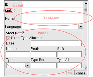
An example of a form with a panel and several Thinlet elements
<?xml version="1.0" encoding="ISO-8859-1"?>
<!-- generated by ThinG, the Thinlet GUI editor -->

<panel top="2" left="2" bottom="2" right="2" columns="2" gap="2" height="1350" width="220" weightx="1">

    <label colspan="1" text="ID"/>
    <textfield colspan="1" property="featureAttribute=FEAT_ID" weightx="1"/>

    <label colspan="1" text="Link"/>
    <textfield colspan="1" property="featureAttribute=LINK_ID"/>

    <label colspan="1" text="Name"/>
    <textarea colspan="1" wrap="true" rows="1" property="featureAttribute=ST_NAME"/>

    <label colspan="1" text="Language"/>
    <combobox colspan="1" property="featureAttribute=ST_LANGCD">
        <choice text="Basque" name="BAQ"/>
        <choice text="Catalan" name="CAT"/>
        <choice text="Croatian" name="SCR"/>
        <choice text="Czech" name="CZE"/>
        <choice text="Danish" name="DAN"/>
        <choice text="Dutch" name="DUT"/>
        <choice text="English" name="ENG"/>
        <choice text="Estonian" name="EST"/>
        <choice text="Finnish" name="FIN"/>
        <choice text="French" name="FRE"/>
        <choice text="Gaelic" name="GAE"/>
        <choice text="Galician" name="GAG"/>
        <choice text="German" name="GER"/>
        <choice text="Greek (Modern)" name="GRT"/>
        <choice text="Hungarian" name="HUN"/>
        <choice text="Italian" name="ITA"/>
        <choice text="Latvian" name="LAT"/>
        <choice text="Lithuanian" name="LIT"/>
        <choice text="Norwegian" name="NOR"/>
        <choice text="Polish" name="POL"/>
        <choice text="Portuguese" name="POR"/>
        <choice text="Slovak" name="SLO"/>
        <choice text="Slovenian" name="SLV"/>
        <choice text="Spanish" name="SPA"/>
        <choice text="Swedish" name="SWE"/>
        <choice text="Welsh" name="WEL"/>
    </combobox>

    <panel top="2" left="2" bottom="2" right="2" colspan="2" columns="3" gap="2" border="true">
    <label colspan="3" text="Steet Name" font="bold"/>

    <checkbox colspan="3" text="Street Type Attached" property="featureAttribute=ST_TYP_ATT;chkValue=Y"/>

    <label colspan="1" text="Base"/>
    <textfield colspan="2" property="featureAttribute=ST_NM_BASE"/>

    <label text="Names"/>
    <label text="Prefix"/>
    <label text="Sufix"/>

    <textfield colspan="1" property="featureAttribute=NUM_STNMES" width="30" height="20" weightx="1"/>
    <textfield colspan="1" property="featureAttribute=ST_NM_PREF" width="30" height="20" weightx="1"/>
    <textfield colspan="1" property="featureAttribute=ST_NM_SUFF" width="30" height="20" weightx="1"/>


    <label text="Type"/>
    <label text="Type Bef"/>
    <label text="Type Aft"/>

    <combobox colspan="1" property="featureAttribute=ADDR_TYPE" width="30" height="20">
         <choice text="Base" name="B"/>
         <choice text="City" name="C"/>
         <choice text="Country" name="D"/>
         <choice text="Old" name="O"/>
         <choice text="Commercial" name="T"/>
    </combobox>

    <textfield colspan="1" property="featureAttribute=ST_TYP_BEF" width="30" height="20"/>
    <textfield colspan="1" property="featureAttribute=ST_TYP_AFT" width="30" height="20"/>

    </panel>

</panel>
